Design Tokens Generator: Simplifying Design Token Management
Design Tokens Generator is a powerful tool that aims to simplify the management of design tokens for designers and web developers.
The goal of the Design Tokens Generator 👑😈🎨👽 is to make design tokens more approachable and user-friendly. Embracing it you can focus on your creative vision while the App takes care of the tedious aspects of design token taxonomy. It provides a streamlined solution for managing design tokens, allowing you to effortlessly establish a strong foundation for your Web Project, App or Design System.
Design Tokens Generator offers an intuitive interface and user-friendly features to streamline the process of working with design tokens and achieve greater design consistency and scalability in projects.
Design Tokens in a Nutshell
Design tokens have revolutionized the way we approach design systems. These platform-agnostic design values serve as the sub-atomic units of a design language, ensuring consistency and coherence across various platforms and projects. Design tokens also enable the creation of a cohesive and harmonious design language. By establishing standardized values for colors, typography, spacing, and other design elements, a consistent visual identity is maintained.
By defining design attributes as tokens, updates or changes can be easily applied and propagated throughout the system. This eliminates the need for manual updates across multiple instances, saving time and effort while ensuring consistency. A single modification to a design token can have a cascading effect, harmonizing the design elements across the entire project.
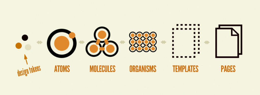
By leveraging the benefits of design tokens, teams can streamline their design processes, enhance collaboration between designers and developers, create more efficient design systems and deliver exceptional user experiences.
The Problem with Design Tokens no one talks about
While design tokens are a simple and powerful concept in theory, their practical implementation can often become daunting and complex. What initially seems like a straightforward solution for maintaining design consistency across projects can quickly turn into a roadblock.
With design tokens teams face the issue of finding the right balance between generality and specificity. Existing open-source solutions often fall into two extremes. On one hand, there are prominent and generic solutions that aim to cover a wide range of use cases. While these solutions may be suitable for larger projects, they can be overwhelming and impractical for smaller-scale projects. On the other hand, there are specific solutions that originate from other team projects. While these may address certain unique requirements, they lack the flexibility needed for customization and adaptation.
In both scenarios, without a proper framework or tool, managing and adjusting design tokens can become a taxonomy nightmare, hindering maintainability and scalability. Struggle with organization, support, and maintenance of their design tokens hampers productivity and can lead to inconsistencies across projects.
In the next section, we’ll get to know the Design Tokens Generator, a solution specifically designed to address these challenges and make working with design tokens more approachable and intuitive.
Introducing the Design Tokens Generator
The Design Tokens Generator was developed as an approachable solution to bridge the gap between the simplicity of design tokens and their practical implementation. It offers a streamlined and intuitive experience for designers and web developers, making design tokens more user-friendly and manageable. The app also strives to simplify the customization of design tokens, empowering you to create and adjust tokens with ease while ensuring consistency and scalability across your projects.
Check out the app on Producthunt for immediate screenshots and more information.
Key Features
Streamlined Design Tokens Naming Model: The app offers an opinionated, simplified and intuitive naming model for design tokens. It allows for easier memorization and organization of tokens, enhancing the efficiency of tokens management.
Sufficient and Effective Tokens for Small- and Mid-Scale Projects: The Design Tokens Generator provides a curated assembly of design tokens that are suitable for small- to mid-scale projects. It eliminates the complexity of dealing with an overwhelming number of tokens, ensuring that you have the necessary tokens without unnecessary clutter.
Intuitive UI for Customization: The app features an intuitive user interface that allows you to customize design tokens according to your project requirements. You can easily adjust prefixes, typescale, color palette, unit formats, and more, enabling you to create a design system that aligns with your unique needs.
Live Interactive Preview Area: The Design Tokens Generator includes a live preview area where you can instantly visualize the adjusted tokens. This allows you to see the impact of your customization in real-time, making it easier to fine-tune and iterate on your design system.
Export to Popular Formats: The app enables you to export your design tokens to popular formats, with CSS variables as the foundation. This makes it effortless to integrate the generated tokens into your frontend codebase and ensure consistency across different platforms.
Now that let’s dive deeper into the practical side of Design Tokens Generator. In the following section, we will explore how design tokens are organized within the Sets and Collections. By understanding these concepts and interface controls, you will gain a deeper understanding of how to harness the power of design tokens for your projects.
Collections, Sets and their Purpose
The Design Tokens Generator is organized in a straightforward and intuitive manner. The app groups design tokens into compact clusters known as Sets. These Sets are then combined into larger groups called Collections.
There are five Collections in the App, each based on design domain principles. Each Collection comprises one or more Sets, providing a robust and complete set of design tokens.
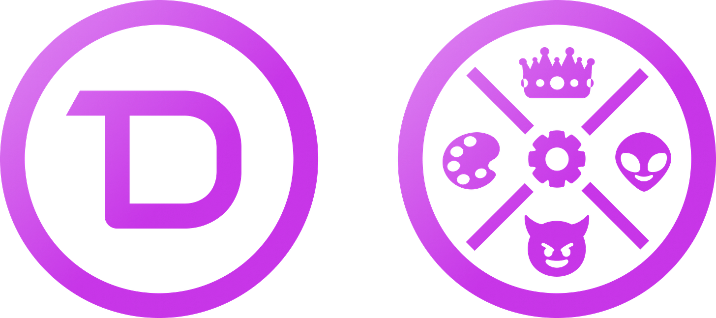
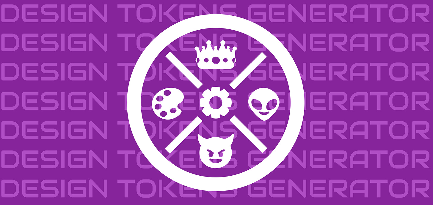
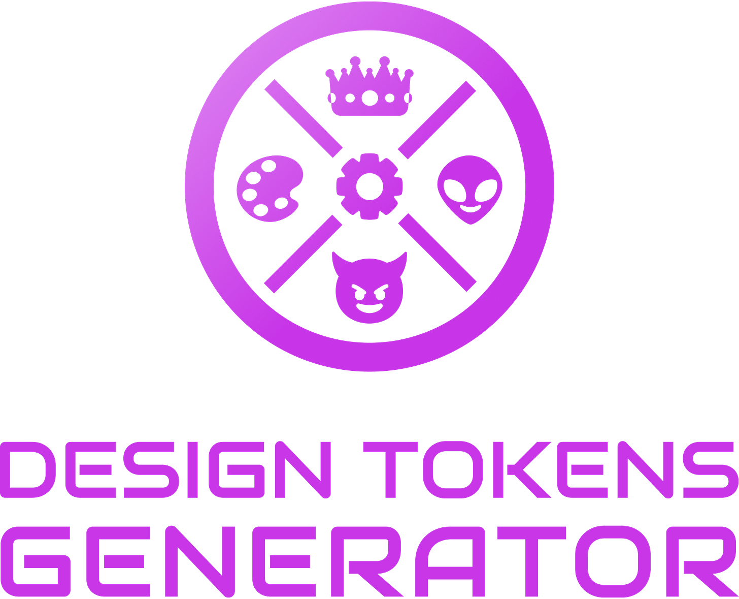
To understand the contents of the Collections, a quick glance at the Design Tokens Generator logo from both sides is sufficient:
Each Collection here is represented by a distinct icon or emoji. These Collections serve as the foundation for organizing and managing your design tokens, revolving around a Core element that drives consistency and coherence throughout a project.
Colors — Palette (🎨) Naturally, the Palette icon represents the extensive Colors Collection. This collection allows you to define and harmonize your color palette, creating a visually appealing and cohesive experience.
Content — Crown (👑) The Crown icon embodies the Content Collection. It focuses on typography and text visualization, ensuring a regal prominence for your textual elements.
Space and Dimension — Alien (👽) The Alien icon signifies the Space and Dimension Collection. Space and dimension (along with sizes) are combined for a generalized approach. This simplifies the management and organization of these design aspects.
Details — Devil (😈) The Devil icon personifies the Details Collection. This collection adds that extra touch, injecting personality and flair into your visual language.
Generic Properties — Cog (⚙️) Lastly, the centerpiece Cog icon represents the collection of Generic Properties (the Core Collection). These properties may not be design-specific or limited to mobile app development but play a fundamental role in shaping your project, such as defining the
root-size.
Now, let’s dive deeper into each Collection and explore the unique Sets they contain. These Collections have been thoughtfully organized to cover various aspects of your design system.
Palette Collection (🎨)
As mentioned earlier, the Palette Collection contains the most Sets and tokens. Here’s a brief overview of the Sets within this Collection:
Brand colors: Primary, Secondary, and Accent color Sets representing a brand’s main color scheme.
Util colors: Safe, Alert, Info, and Warning color Sets for elements like loading indicators, error messages, and notifications.
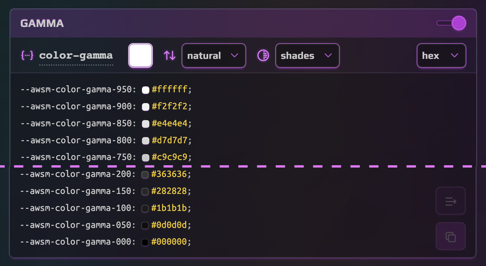
Foundation colors: Gamma, Base, and Contrast color Sets. Gamma offers a range of shades, while Base and Contrast define background and content colors for high contrast and accessibility.
Text colors: A standalone Text Set with regular, strong, subtle, and accent variations.
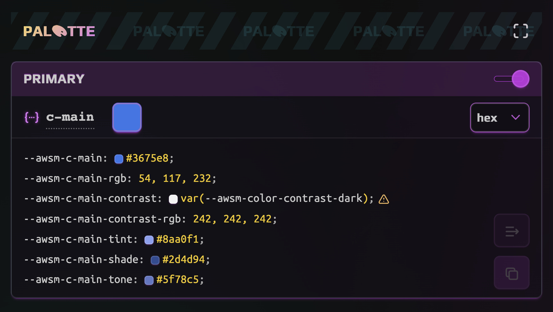
Let’s take a closer look at the structure of a color Set (excluding Foundation colors). Each Set consists of the following values: base, contrast, tint, shade, and tone. The lead color (Primary #3675e8 in this example) is tweakable, and other values are calculated automatically.
contrast: the color that provides sufficient contrast to the base color (values are inherited from the Gamma Set)
tint: a brighter and more intense variation of the base color
shade: a darker and less vibrant variation of the base color
tone: a mixture of the base color with a neutral gray
For Gamma, you can also define the lead color and adjust the gamma progression control:
Text colors have regular, strong, subtle, and accent variations, with the option to switch or invert them depending on your primary theme. Experimenting with the Gamma and Text settings can help achieve the desired result for your project.
To explore the Palette Collection further please refer to the guide.
Content Collection (👑)
The Content Collection focuses on three essential Sets: Font Size, Line Height, and Icon Size.
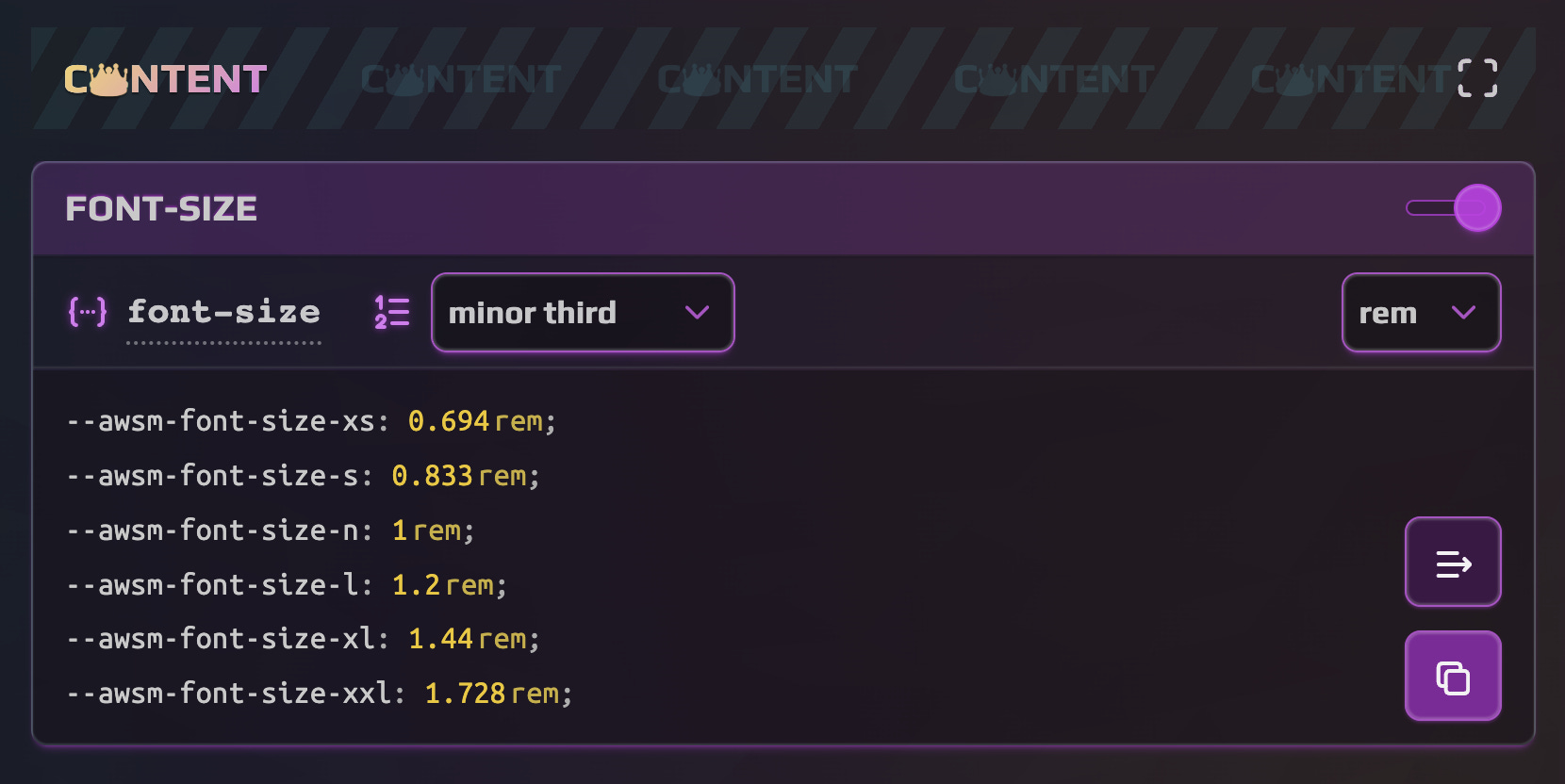
Font Size and Icon Size Sets share similar naming conventions and settings options. The tokens in these Sets follow a “t-shirt” approach, ranging from xs to xxl, with a default base n value of 1rem (16px). The values for other tokens are calculated based on the chosen scale setting, which determines the progression of the tokens.
Scale options represent multipliers that build upon the previous value, allowing for distinct or subtle differences in size. Practically this control uses the type scale generation principles, allowing to have a quick all-in-one solution within the app.
The Line Height Set, on the other hand, is controlled slightly differently due to the nature of this property. It typically requires fewer values. The tokens in this Set include regular, tight, and loose, representing different line spacing options.
In summary, the Content Collection provides you with the tools to control the sizes of fonts, line heights, and icons in your design system. To explore the Content Collection further please refer to the guide.
Space Collection (👽)
The Space Collection in the Design Tokens Generator consists of two sets: the main Set — Spacing and the auxiliary Set — Local.
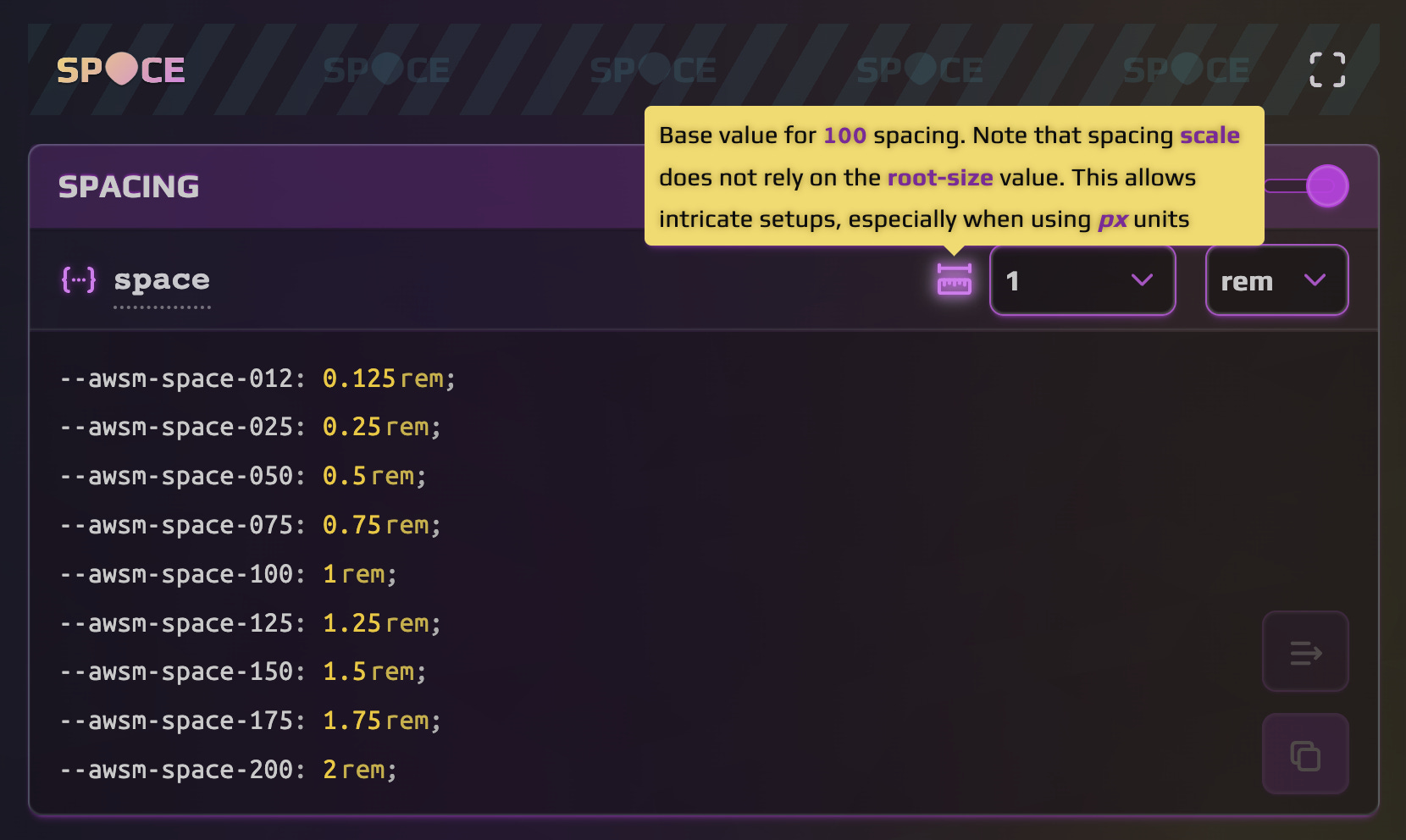
The Spacing Set provides a range of spacing tokens, named with a numeric convention such as space-075, space-100, space-125, and so on. The base token, space-100, serves as the reference point, and other values are derived from it using a progression factor. This approach offers a practical and intuitive way to work with spacing, allowing you to easily calculate and adjust values based on the base token.
The progression of the spacing scale is (almost) linear, unlike the typography generation style. It follows the design principle of using a standard grid with 2 or 4-pixel increments, which simplifies offset setups and ensures easy maintenance.
However, if you need specific measurements that don’t align with the scale, you can calculate them on the spot using the base token (space-100) and multiplying it by the desired factor.
The Local Set within the Space Collection introduces specific pattern-like tokens that are particularly useful in web and mobile app development. These tokens can be customized and experimented with to meet the specific needs of your project. In addition to the predefined tokens, you also have the flexibility to add custom spacing tokens based on specific use cases. Naming them according to their purpose enhances their association with particular patterns in your project.
Welcome to further explore the Space Collection in the guide document.
Details Collection (😈) aka “the Det😈ils”
It’s getting hotter and more exciting!
Details play a crucial role in enhancing the user experience. While too many details can be overwhelming, carefully chosen details can elevate the overall design. The Sets in the Details Collection are diverse and not directly related to each other, but they can inherit color and spacing values from other Sets within the design system.
Radius: This Set focuses on defining the radii of elements. It includes tokens for standard values like small, medium, and large, as well as auxiliary tokens like round and pill, which determine the shape of the element.
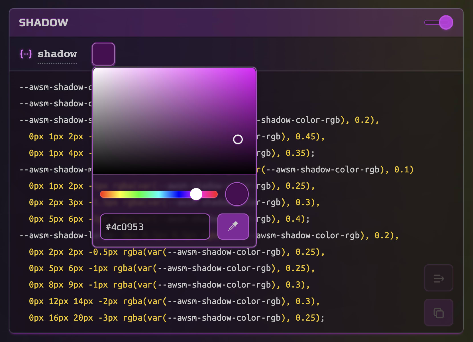
Shadow: The Shadow Set offers natural-looking shadow tokens along with the tint color. Tokens are named small, medium, and large for consistent usage. The tint color can be adjusted based on the design requirements of your project. Typically, it is derived from black or dark shades of gray, however you may need to adapt the tint color to ensure a more cohesive and natural appearance.
Duration: The Duration Set consists of tokens that control transitions and animations in your application and implement the time concept. The available tokens include instant, short, regular, long, and extra values. When selecting a base value and scale for timing tokens, consider that the duration of transitions should be proportionate to the size of the element. Larger elements generally require longer transitions, while smaller elements benefit from shorter and more responsive animations.
Finally, the Selection Set enables you to control the colors for content selection in your project. While often overlooked, customizing the selection colors can easily add an individual touch to the overall design.
Welcome to explore the Details Collection on a dedicated page.
Core Collection (⚙️)
The Core Collection is composed of a single Set that contains a crucial token for global control over the scale of your application. This token is named root-size and represents the font-size value that can be applied to the root element, typically the html tag in web projects. By default, the root font size is set to 16px in most modern browsers.
The root-size token can be utilized in calculations for relative values. For instance:
html {
 font-size: var(--awsm-root-size);
}

@media (min-width: 1200px) {
 html {
   font-size: calc(1.25 * var(--awsm-root-size));
 }
}
In this example, the font-size of the root element is set to the value of --awsm-root-size, and for viewport widths larger than 1200px, it is increased by a scale factor of 1.25.
Using the rem unit in conjunction with the root-size token ensures a consistent visual style for your application, irrespective of the device resolution or rendering medium. It also helps maintain accessibility compliance when users zoom in or out. By controlling the root-size token, you can establish a consistent and responsive typography system across your entire application.
Flexibility and Control
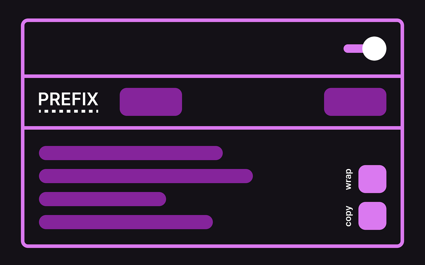
Each tokens Set consistently bears the minimum amount of similar controls, specifically the Prefix editor and Toggle control, allowing for more flexible organization of your design tokens output.
Prefix editor allows you to modify the prefix for the Set. When you change the prefix, all related tokens that use the current tokens as aliases will be updated in real time.
Toggle control allows you to include or exclude the current Set from the final output. By default, the Set is included in the output. Note, that the Preview area will always visualize all token values regardless of the toggle state.
If we “zoom out” to the global scope of the app, we’ll find the Global Prefix editor in the central area of the Header. This control allows you to customize the overall assembly of design tokens according to your specific project requirements. Global prefixes are commonly used in UI libraries and design systems to prevent variable clashes and accidental overrides. They also make it easier to distinguish between custom and inherited tokens in your codebase.
Another global feature of Design Tokens Generator is the Auto-save functionality. It’s convenient when you need to take a break between design sessions and ensure consistency of your changes. Additionally app allows to quickly reset all customizations to the original state.
It’s worth noting that saved changes are local to your browser and may be reset if you clear your browser data. The app strives to preserve your data, but depending on the complexity of updates and release changes, there may be cases where everything is reset. Therefore, it’s recommended to save your work externally to ensure its safety.
Those and other useful controls can be further explored in the official guide.
Wrapping Up
I hope that Design Tokens Generator 👑😈🎨👽 can be used with fun and practicality to your everyday work. The aim is to provide you with a tool that enhances your creative process and makes your projects more enjoyable to develop.
My primary focus with this App is to make design tokens and design system establishment more approachable for small- and mid-scale projects, regardless of team size and expertise. It can be a perfect companion for the Design, Frontend, Full-stack and Product management needs in Web and App development areas.
Your feedback is valuable and welcome. If you have any suggestions for improvement, feature requests, or general feedback, please reach out.
Also feel free to reach out to me for collaboration opportunities or to share your thoughts on how the app can be further enhanced to meet your needs. Please refer for more information to the About page.
Bookmark Design Tokens Generator and stay tuned for new releases, updates and useful tutorials!


